Get ready to fall head over heels for the most gorgeous neutral kitchen cabinets that are absolutely transforming homes everywhere! If you’ve been dreaming of a kitchen that feels like a warm hug every time you walk in, you’re in for a treat. Neutral tones are having their ultimate moment right now, and we couldn’t be more excited to share these stunning cabinet ideas that prove “neutral” is anything but boring. From creamy ivories to sophisticated taupes and dreamy soft grays, these 25 breathtaking looks will inspire you to create a space that’s equal parts cozy, chic, and totally timeless. Whether you’re planning a full renovation or just craving some serious design inspiration, prepare to screenshot, save, and obsess over every single one of these swoon-worthy kitchens!
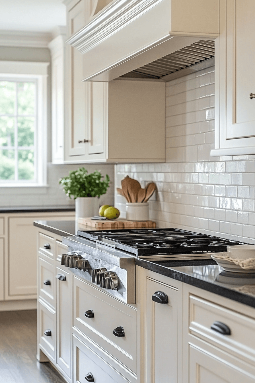
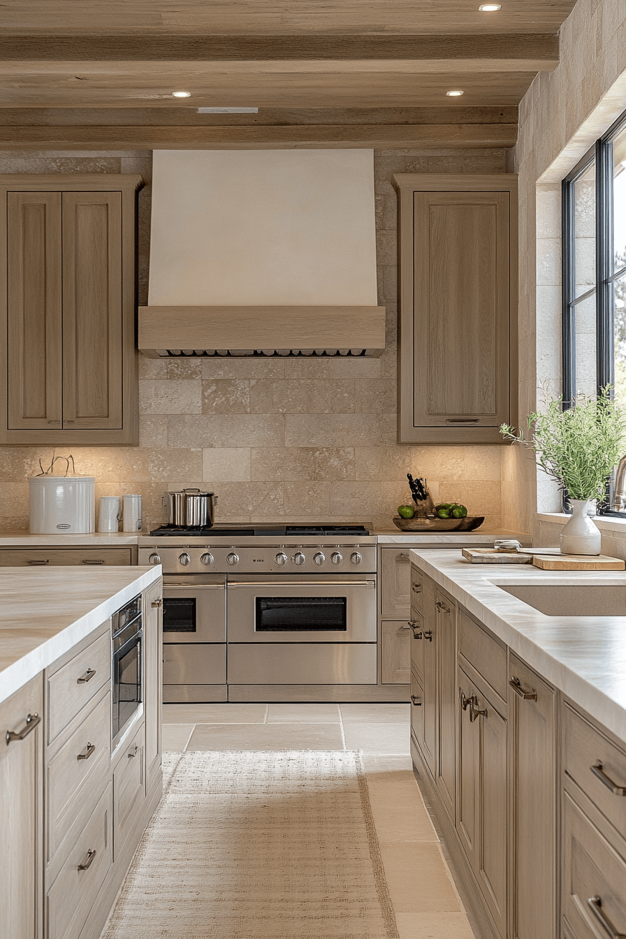
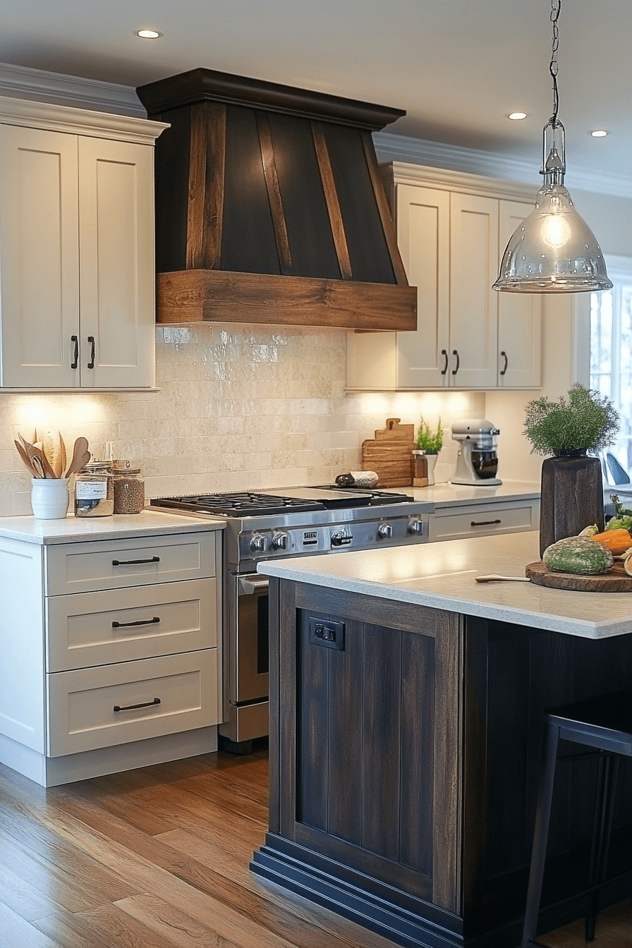
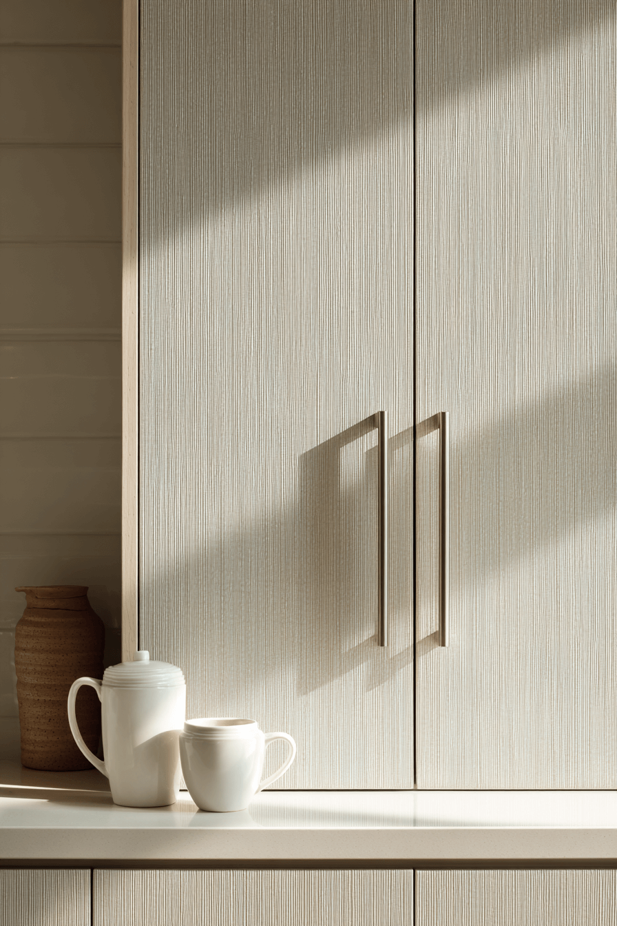
1. Beige Breeze Cabinet Vibes
Neutral kitchen cabinets in a soft beige shade bring gentle warmth and timeless appeal to any kitchen. Their adaptable tone complements both sleek modern spaces and cozy rustic settings with ease. By reflecting natural light, they create an airy, inviting atmosphere that feels instantly welcoming. This palette also offers a calm backdrop for both bold accents and subtle tones. Whether you’re sipping coffee or hosting guests, the vibe stays elegant and relaxed.
🎨 Steal This Look
- Paint Color: Sherwin-Williams Accessible Beige SW 7036
- Furniture: warm white shaker cabinets with brushed brass pulls, light oak floating shelves, cream-colored upholstered bar stools
- Lighting: matte brass globe pendant lights over island
- Materials: natural oak wood tones, honed marble or quartz countertops, woven rattan or linen textiles, unlacquered brass hardware
There’s something quietly luxurious about beige cabinets that feel lived-in from day one—they don’t demand attention, they simply hold the room together.
2. Creamy Glow Kitchen Style
Creamy neutral kitchen cabinets create a light, peaceful ambiance that soothes the senses. These cabinets pair effortlessly with natural stone, wood, and soft linens, adding texture and warmth to your space. Their versatility makes them ideal for urban apartments or countryside homes alike. The creamy tone feels both modern and classic, offering endless room for personalization. Whether it’s your cooking hub or your quiet retreat, it always feels right.
🌟 Steal This Look
- Paint Color: Benjamin Moore White Dove OC-17
- Furniture: Shaker-style cream painted cabinets with brushed brass pulls, white oak floating shelves, marble waterfall island
- Lighting: Brass dome pendant lights over island, recessed can lights with warm 2700K bulbs
- Materials: Honed Calacatta marble, white oak, natural linen, unlacquered brass, ceramic subway tile
There’s something quietly luxurious about a kitchen that doesn’t shout—creamy cabinets feel like Sunday morning coffee no matter what day it is.
3. Ivory Blush Cabinet Finish
Ivory-toned neutral kitchen cabinets bring a crisp, fresh look that perfectly fits modern simplicity. Their light hue makes the room feel more expansive and open, especially in smaller kitchens. Clean lines and uncluttered design contribute to a polished, streamlined aesthetic. Ivory is an incredibly versatile choice—it can shine with matte black or blend in with tonal textures. The result is timeless and full of light.
💡 Steal This Look
- Paint Color: Farrow & Ball Wimborne White No.239
- Furniture: Flat-panel ivory kitchen cabinets with integrated pulls, waterfall-edge quartz island, matte black bar stools
- Lighting: Linear LED pendant over island, recessed can lights
- Materials: Brushed brass hardware, honed Carrara marble backsplash, light oak open shelving, matte black fixtures
There’s something quietly luxurious about ivory cabinets that bright white can’t touch—they soften morning light in a way that feels lived-in, not laboratory.
4. Chiffon Drift Kitchen Hues
Chiffon-colored neutral kitchen cabinets add a soft, graceful layer of elegance to your kitchen. The gentle tone brings a romantic, light-filled feeling to both classic and contemporary spaces. These cabinets pair beautifully with everything from white marble to walnut wood floors. Their subtle shade elevates the room without overwhelming your senses. It’s a look that feels refined, balanced, and effortlessly chic.
✎ Steal This Look
- Paint Color: Behr Chiffon White 12
- Furniture: Shaker-style neutral kitchen cabinets in warm off-white, Carrara marble waterfall island, walnut bar stools with woven rush seats
- Lighting: Brass globe pendant lights over island, recessed can lights with warm dimmers
- Materials: Honed Carrara marble countertops, brushed brass hardware, natural walnut flooring, linen-textured roman shades
There’s something quietly luxurious about a kitchen that whispers instead of shouts. Chiffon cabinets feel like wearing your favorite cashmere sweater—elevated comfort you never want to leave.
5. Taupe Dream Cabinet Look
Taupe-hued neutral kitchen cabinets bring grounded elegance and depth to your kitchen design. The rich, warm tone adds cozy sophistication while maintaining a relaxed, approachable feel. Taupe works beautifully with black accents, wood finishes, and even matte metals. It hides everyday smudges with ease, making it a smart choice for high-traffic kitchens. The vibe is earthy, upscale, and inviting.
✎ Steal This Look
- Paint Color: Valspar Stonehenge Greige 5005-2B
- Furniture: taupe-painted shaker cabinets with matte black bar pulls, natural oak floating shelves, black metal bar stools with woven seats
- Lighting: matte black dome pendants over island, warm LED under-cabinet strips
- Materials: honed black granite or soapstone countertops, white oak open shelving, brushed brass or matte black hardware, textured ceramic backsplash
There’s something quietly luxurious about taupe—it reads expensive without trying too hard, and it ages beautifully as trends shift around it.
6. Porcelain Calm Color Vibe
Porcelain-white neutral kitchen cabinets light up your kitchen with clean, bright energy. Their luminous tone amplifies both natural and artificial light, instantly opening up the space. Porcelain acts as a neutral backdrop for any style direction—whether monochromatic or colorful. The slight warmth in the finish keeps the look soft, not sterile. It’s perfect for homeowners who crave light without losing comfort.
🎨 Steal This Look
- Paint Color: PPG Pure White PPG100-1
- Furniture: White oak waterfall island with integrated storage, slim-profile bar stools in natural linen
- Lighting: Matte brass linear pendant over island, recessed can lights with warm 3000K bulbs
- Materials: Polished porcelain tile backsplash, brushed brass hardware, white oak flooring, Carrara marble-look quartz countertops
There’s something quietly luxurious about a porcelain kitchen that glows at golden hour—it feels like the room itself is exhaling.
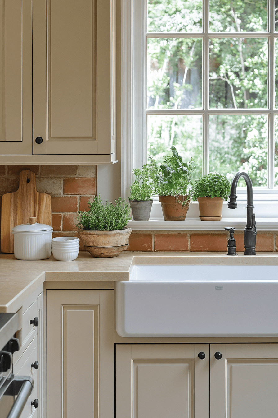
7. Sand Haze Cabinet Appeal
Sandy-toned neutral kitchen cabinets offer a relaxed, earthy look that channels coastal charm. The warm beige shade pairs effortlessly with wood accents, woven textures, and creamy whites. This calming tone works especially well in sunny kitchens, enhancing that natural glow. It’s a perfect fit for laid-back homes where simplicity and warmth go hand in hand. These cabinets feel like a seaside breeze in design form.
🏠 Steal This Look
- Paint Color: Dunn-Edwards Sandcastle DET439
- Furniture: Natural oak kitchen island with butcher block top, rattan bar stools with cream cushions
- Lighting: Woven rattan pendant lights over island, aged brass sconces flanking window
- Materials: White oak cabinetry, jute runner, unglazed terracotta pots, linen cafe curtains, driftwood accents
This is the kitchen that smells like fresh bread and feels like barefoot mornings—unfussy, sun-drenched, and quietly pulled together.
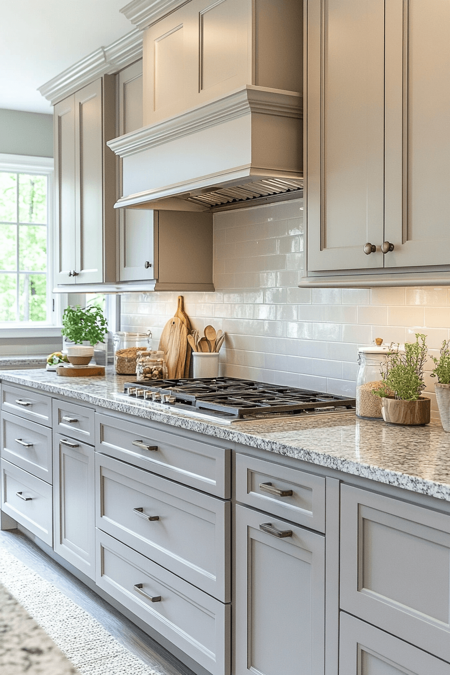
8. Stone Blend Kitchen Tones
Stone-colored neutral kitchen cabinets bring quiet sophistication and natural beauty to your kitchen space. The soft gray undertone offers a modern twist on traditional neutrals, ideal for sleek designs. Stone tones pair effortlessly with stainless steel appliances, textured backsplashes, or bold lighting. This shade creates a calming canvas for any decor style. Its cool undertone adds refinement without feeling cold.
✎ Steal This Look
- Paint Color: Clare Paint Seize the Gray CW-01
- Furniture: Minimalist stone-gray shaker cabinets with brushed nickel pulls, waterfall quartz island with subtle veining
- Lighting: Matte black linear pendant lights with warm brass interior accents
- Materials: Honed marble backsplash, wire-brushed white oak flooring, matte ceramic subway tile
There’s something grounding about stone-toned cabinets—they feel like they belong in the space rather than demanding attention. This is the kitchen equivalent of your favorite worn-in linen shirt.
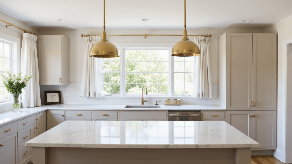
9. Whisper White Cabinet Beauty
Crisp white neutral kitchen cabinets brighten your kitchen while delivering pure, versatile style. Their clean finish reflects light, making even small spaces feel bigger and more inviting. White acts as a design chameleon—perfectly supporting vibrant colors or minimalist palettes. These cabinets never go out of style and always feel fresh. They’re the ultimate base for creativity and comfort.
🏠 Steal This Look
- Paint Color: Fine Paints of Europe Hollandlac Brilliant Whisper White W1001
- Furniture: White shaker-style base and wall cabinets with brushed nickel cup pulls, light oak open shelving, Carrara marble waterfall island
- Lighting: Matte black schoolhouse pendant lights over island, recessed can lights with warm 2700K bulbs
- Materials: High-gloss lacquered cabinet finish, honed marble countertops, white subway tile backsplash, natural wood flooring
There’s something quietly luxurious about walking into a kitchen where every cabinet surface glows with intention—white done right feels like breathing room.
10. Gray Drift Soft Elegance
Soft gray neutral kitchen cabinets offer a chic middle ground between warm and cool tones. This understated hue brings calm to the space while staying current with modern design trends. Grey plays well with everything—gold, wood, marble, or matte black. Its subtle presence adds elegance without ever feeling too stark. The result is a look that’s sophisticated and serene.
🌟 Steal This Look
- Paint Color: Backdrop Dormitory GC-42
- Furniture: Slab-front gray lower cabinets with integrated pulls, waterfall-edge marble island, brass bar stools with leather seats
- Lighting: Linear brass pendant lights over island, recessed can lights with warm dim
- Materials: Honed Carrara marble, brushed brass hardware, white oak open shelving, matte ceramic backsplash
This is the kitchen you want when you’re tired of white but not ready for navy—gray drift feels like a deep breath, elegant without trying too hard.
11. Milky Glow Kitchen Calm
Neutral kitchen cabinets in a creamy milk tone create a cozy yet sophisticated kitchen that feels instantly welcoming. The soft, off-white color is warm on the eyes and makes the space feel bright without harshness. It blends beautifully with wood, stone, and gold finishes for a naturally layered look. Whether your home is farmhouse-inspired or contemporary chic, this shade adapts effortlessly. The result is smooth, serene, and undeniably inviting.
🌟 Steal This Look
- Paint Color: Sherwin-Williams Alabaster SW 7008
- Furniture: Shaker-style neutral kitchen cabinets with simple brushed brass pulls, light oak floating shelves, and a natural wood dining table with woven rush seats
- Lighting: Large milk glass globe pendant lights over the island with warm 2700K bulbs
- Materials: Creamy matte cabinet finish, honed Carrara marble countertops, light white oak flooring, and aged brass hardware
There’s something quietly luxurious about a kitchen that doesn’t shout—this palette whispers ‘slow morning coffee’ in the best way.
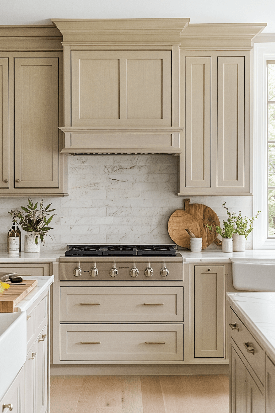
12. Almond Touch Neutral Vibes
Toasted almond neutral kitchen cabinets offer a sun-kissed warmth that radiates comfort and hospitality. The golden-beige hue pairs seamlessly with natural materials, creating harmony in open-concept kitchens. It’s a rich yet approachable shade that invites conversation and togetherness. This tone adds visual depth while keeping the space light and balanced. Perfect for a kitchen that serves as the heart of the home.
🖼 Steal This Look
- Paint Color: Benjamin Moore Toasted Almond 1098
- Furniture: warm oak dining table with woven rattan bar stools, open shelving in natural birch
- Lighting: brass dome pendant lights with warm Edison bulbs
- Materials: honey-toned oak, woven rattan, unglazed terracotta, brushed brass
This is the kitchen where Sunday morning coffee stretches into afternoon—warm, unhurried, and genuinely lived-in.
13. Cozy Wool Kitchen Blend
Neutral kitchen cabinets in a wool-like beige tone bring softness and subtle luxury to your space. Think cozy sweater vibes translated into cabinetry—inviting, textured, and stylish. This hue works beautifully with light woods, brushed metals, or muted pastels. It’s calming without feeling plain, and warm without being heavy. The result is a kitchen that wraps you in comfort.
✎ Steal This Look
- Paint Color: Farrow & Ball Skimming Stone 241
- Furniture: light oak floating shelves, woven rush counter stools, butcher block kitchen island
- Lighting: brass dome pendant lights with frosted glass
- Materials: raw wool textiles, bleached oak, unlacquered brass, hand-thrown ceramic dishware
There’s something deeply comforting about a kitchen that feels like it could give you a hug—this wool-beige palette does exactly that, especially when morning light hits those cabinets.
14. Misty Cream Shade Style
Pale parchment neutral kitchen cabinets bring an elegant vintage-inspired touch to a clean, contemporary kitchen. This soft beige shade feels light and romantic while maintaining a timeless sense of style. It works beautifully with gold hardware, charcoal accents, or creamy countertops. The overall aesthetic feels fresh yet nostalgic—perfect for those who love a classic look with modern function. It’s delicate, graceful, and endlessly versatile.
🎨 Steal This Look
- Paint Color: Behr Misty Cream PPU6-11
- Furniture: Shaker-style neutral kitchen cabinets in pale parchment with brushed gold bar pulls, paired with a white marble waterfall island and vintage-inspired open shelving
- Lighting: Brass globe pendant lights with frosted glass shades over the island
- Materials: Honed Calacatta marble countertops, natural oak flooring, matte ceramic subway tile backsplash, aged brass hardware, linen window treatments
There’s something quietly luxurious about this palette—it reminds me of Sunday mornings in a Parisian apartment, where everything feels intentional yet utterly relaxed.
15. Canvas Warmth Cabinet Glow
Clean white neutral kitchen cabinets provide the ultimate fresh start for any kitchen vision. Their bright, light-reflecting finish creates an open and airy feeling that energizes the space. This minimalist-friendly color serves as a perfect base for bold backsplashes, colorful appliances, or wood elements. Whether you lean classic, modern, or boho, white cabinets keep everything looking cohesive. It’s a timeless favorite that never loses its magic.
💡 Steal This Look
- Paint Color: Valspar Ultra White 7006-24
- Furniture: Clean-lined shaker cabinets with brushed brass pulls, light oak floating shelves, white quartz waterfall island
- Lighting: Sleek matte black pendant lights with warm Edison bulbs over the island
- Materials: Matte white lacquer cabinet fronts, warm natural oak accents, honed Carrara marble backsplash, brass hardware
There’s something quietly luxurious about a white kitchen that doesn’t try too hard—it feels like a deep breath, a Sunday morning with coffee and nowhere urgent to be.
16. Buff-Toned Kitchen Softness
Barely-there buff-toned neutral kitchen cabinets offer a whisper of creamy warmth, ideal for a soothing and elegant kitchen design. This ultra-soft hue bridges the gap between white and beige, making it feel fresh yet cozy. It complements a wide range of finishes—from polished chrome to matte black or rustic oak. The look is calm, contemporary, and quietly refined. Perfect for anyone who wants subtle sophistication with lasting appeal.
★ Steal This Look
- Paint Color: PPG Delicate White PPG1001-1
- Furniture: Shaker-style cabinets in buff-cream finish, white oak floating shelves, brushed brass bar stools with woven seats
- Lighting: Matte black pendant lights with clear glass shades over island
- Materials: Honed Calacatta marble countertops, white oak open shelving, polished chrome cabinet pulls, natural linen window treatments
This is the kitchen equivalent of a perfect cashmere sweater—understated, expensive-feeling, and impossible to tire of. I’ve seen this tone transform sterile white kitchens into spaces that actually feel lived-in and loved.
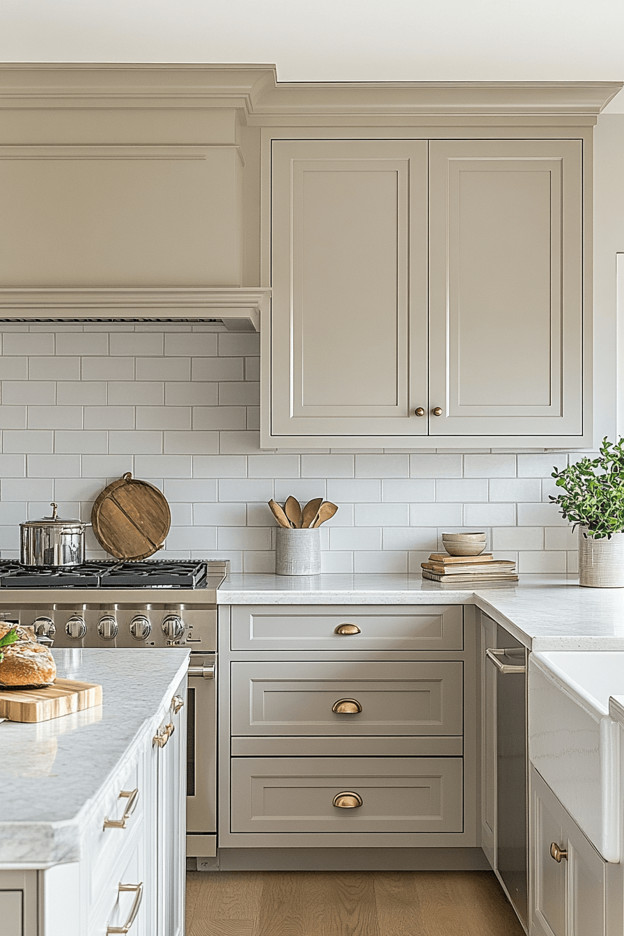
17. Neutral Flow Style Finish
Neutral kitchen cabinets in a balanced mid-tone bring harmony and design longevity to any kitchen. With an even blend of warm and cool undertones, this versatile color anchors your space with ease. It complements everything from sleek stainless steel to handcrafted ceramics. The result is a calm, grounded aesthetic that evolves effortlessly with seasonal trends. No matter your decor direction, this tone supports it all.
🏠 Steal This Look
- Paint Color: Dunn-Edwards Whisper Gray DEW 382
- Furniture: Shaker-style neutral cabinets in warm gray-beige with brushed brass pulls, floating wood shelves in natural oak
- Lighting: Matte black pendant lights with warm Edison bulbs over the island
- Materials: Quartz countertop in soft white with subtle veining, hand-glazed ceramic tile backsplash, natural linen window treatments
This is the cabinet color you live with for decades—the one that forgives your brass phase, your black hardware era, and whatever comes next. It quietly works while everything around it changes.
18. Sepia Tone Cabinet Chic
Sepia-toned neutral kitchen cabinets bring a touch of vintage charm to a modern space with their warm, muted hue. This soft brown-beige tone feels rich yet relaxed, offering the perfect balance of depth and softness. It pairs effortlessly with natural wood, brass accents, or crisp marble countertops. The vibe is cozy, earthy, and quietly luxurious. It’s a look that adds character without shouting for attention.
✎ Steal This Look
- Paint Color: Clare Paint Cocoa Sand CW-50
- Furniture: Warm white oak kitchen island with waterfall edge, vintage-inspired brass bar stools with leather seats, open shelving in natural walnut
- Lighting: Schoolhouse-style brass pendant lights with milk glass shades over the island
- Materials: Honed Calacatta marble countertops, unlacquered brass hardware, natural linen window treatments, terracotta floor tile
There’s something quietly confident about sepia cabinets—they feel collected rather than decorated, like a kitchen that’s been loved for generations. I always tell clients this is the shade to choose when they want timeless over trendy.
19. Flax Fresh Kitchen Hue
Frost-inspired neutral kitchen cabinets bring a light and ethereal feel to your kitchen with their soft grey-beige hue. This cool-toned shade plays with natural light, gently shifting throughout the day for subtle elegance. Frost tones look especially striking with matte black, silver, or textured wood elements. The effect is breezy, calming, and ultra-modern. It’s a perfect palette for open floor plans or Scandinavian-inspired kitchens.
🎨 Steal This Look
- Paint Color: Fine Paints of Europe Flax Fresh Kitchen Hue FPE-19
- Furniture: flat-panel lower cabinets in warm white oak with integrated pulls, waterfall-edge quartz island in soft grey-veined white
- Lighting: matte black linear LED pendant over island, slim cylindrical sconces flanking window
- Materials: brushed silver cabinet hardware, textured white oak open shelving, frosted glass upper cabinet inserts, honed marble backsplash
This flax-fresh kitchen reads like morning light on a quiet lake—cool, calm, and intentionally uncluttered. It works hardest in homes where the kitchen flows into living space and needs to feel cohesive, not competing.
20. Cream Oasis Color Touch
Neutral kitchen cabinets in an oatmeal-inspired shade offer the perfect mix of cozy and contemporary. This beige-grey tone is soft, natural, and endlessly versatile. It works beautifully with exposed beams, white tile, or brushed brass fixtures. Oatmeal hues create a kitchen that feels lived-in and loved while still looking polished. It’s ideal for creating a calm, cohesive look that adapts to any season.
🖼 Steal This Look
- Paint Color: Backdrop Oatmeal 04
- Furniture: Shaker-style base cabinets in warm oatmeal, floating wood shelves with iron brackets, farmhouse dining table with turned legs
- Lighting: Exposed bulb pendant lights with brushed brass sockets, woven rattan semi-flush mount
- Materials: White zellige tile backsplash, reclaimed oak beams, honed marble countertops, matte brass hardware
This is the kitchen you walk into barefoot on Sunday morning—soft light, coffee brewing, nothing trying too hard. The oatmeal tone forgives fingerprints and evolves beautifully as brass fixtures patina over time.
21. Linen Light Cabinet Serenity
Linen-toned neutral kitchen cabinets bring a sense of effortless calm and breezy sophistication to any space. This soft shade keeps your kitchen feeling light, open, and full of gentle energy. It’s the ideal match for minimalist designs or relaxed coastal vibes. Linen pairs beautifully with natural textures, warm woods, and subtle metallics. The overall effect is clean, timeless, and refreshingly low-maintenance.
✎ Steal This Look
- Paint Color: Sherwin-Williams Linen SW 9109
- Furniture: slim-profile island with waterfall butcher block countertop, open walnut shelving, matte black bar stools with woven seats
- Lighting: oversized rattan pendant over island, recessed can lights with warm 2700K bulbs
- Materials: unfinished white oak flooring, brushed brass cabinet pulls, hand-thrown ceramic backsplash tile, raw linen window treatments
There’s something deeply satisfying about a kitchen that feels like a deep breath—linen cabinets deliver that quiet luxury without trying too hard.
22. Cashmere Mist Kitchen Calm
Cashmere-inspired neutral kitchen cabinets offer plush elegance wrapped in quiet confidence. This refined grey-beige tone sets a peaceful mood, perfect for contemporary kitchens with a touch of warmth. It blends beautifully with high-end finishes like matte gold, textured stone, or glass details. The soft, cozy feel adds subtle luxury without being overwhelming. It’s a versatile option for those who want their kitchen to feel like a refined retreat.
✎ Steal This Look
- Paint Color: Benjamin Moore Cashmere Mist 1005
- Furniture: Sleek flat-panel cabinets in warm greige lacquer finish, waterfall-edge quartz island, brass bar stools with linen upholstery
- Lighting: Matte gold linear pendant lights with frosted glass globes over the island
- Materials: Honed Calacatta marble backsplash, brushed brass hardware, ribbed glass cabinet inserts, white oak flooring
This is the kitchen for someone who hosts Sunday morning coffee, not dinner parties—quiet luxury that feels lived-in from day one.
23. Ashen Glow Cabinet Mood
Ash-grey neutral kitchen cabinets bring a polished and modern edge to your culinary space. The cool undertones create a crisp foundation that balances beautifully with warm woods or dark accents. Ash-grey feels sleek yet grounded, perfect for those who love subtle drama. This color brings refined style without overpowering the rest of your design. It’s ideal for urban kitchens and contemporary spaces alike.
💡 Steal This Look
- Paint Color: Farrow & Ball Pavilion Gray 242
- Furniture: Flat-panel ash-grey base cabinets with matte black bar pulls, waterfall-edge quartz island in warm white veining
- Lighting: Linear LED pendant in brushed brass with frosted glass diffusers
- Materials: Wire-brushed white oak flooring, honed black granite perimeter countertops, matte ceramic subway tile backsplash
There’s something quietly confident about ash-grey—it doesn’t beg for attention but holds the room together. I keep coming back to it for clients who want modern without the coldness of pure white.
24. Buff Beige Color Pop
Warm beige neutral kitchen cabinets infuse your space with golden comfort and inviting charm. This versatile tone feels sunny and grounded, making it a natural fit for cozy, open-plan living. It pairs seamlessly with stone counters, terra cotta tiles, or wood flooring. The result is a space that feels welcoming, cohesive, and full of life. It’s a palette that celebrates togetherness and timeless beauty.
★ Steal This Look
- Paint Color: Behr Buff Beige HDC-NT-04
- Furniture: Shaker-style buff beige base cabinets with warm wood open shelving above, natural stone waterfall island, woven rattan bar stools with leather seats
- Lighting: Brass dome pendant lights with warm Edison bulbs over the island
- Materials: Honed Calacatta Gold marble, terracotta zellige tile backsplash, wide-plank white oak flooring, aged brass hardware, linen window treatments
There’s something deeply comforting about a kitchen bathed in buff beige—it feels like morning light even on gray days, and it makes everyone want to linger at the island with coffee in hand.
25. Sandy Veil Kitchen Bliss
Sand-toned neutral kitchen cabinets offer effortless elegance with a coastal-meets-modern feel. This gentle hue adds warmth without heaviness, allowing other design elements to shine. It complements natural textures like driftwood, rattan, or matte metals with ease. The result is a serene, grounded kitchen that feels both current and classic. Sand tones offer the perfect middle ground for relaxed yet elevated spaces.
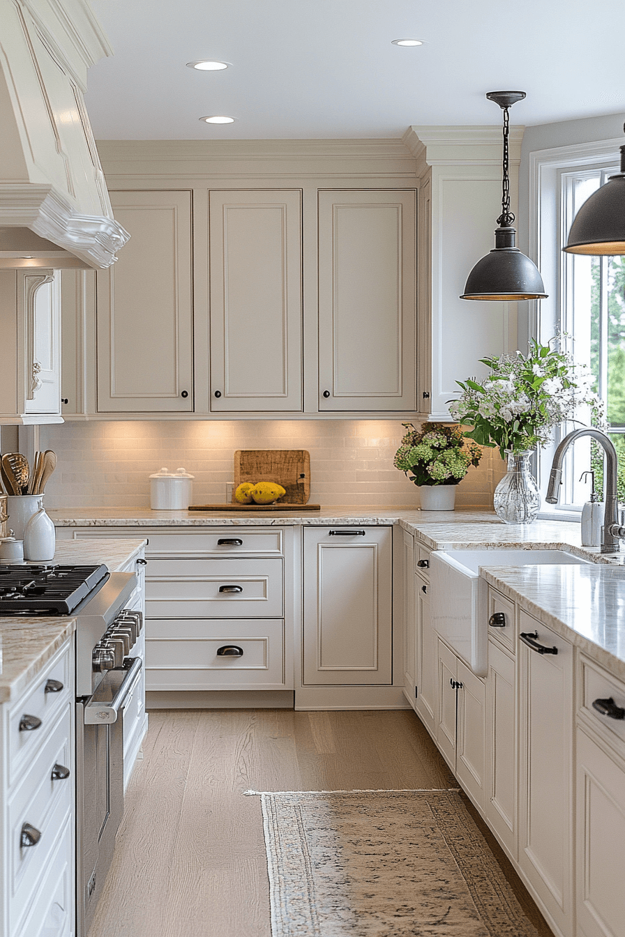
Neutral kitchen cabinets offer a timeless foundation that keeps your kitchen feeling stylish and welcoming year after year. Their soft balanced tones make it easy to pair with changing decor while maintaining a cohesive look. Neutral kitchen cabinets bring a sense of calm and elegance that never feels overwhelming. These designs show how simplicity can still feel warm and refined. When you choose neutral kitchen cabinets you create a kitchen that stays beautiful through every season.
🌟 Steal This Look
- Paint Color: Valspar Sandy Veil 2005-10B
- Furniture: slab-front sand-toned lower cabinets with warm white uppers, driftwood open shelving, woven rattan bar stools
- Lighting: matte black linear pendant over island, natural linen drum pendants over sink
- Materials: quartz with subtle veining, brushed brass hardware, seagrass accents, whitewashed oak flooring
This is the kitchen that feels like a deep exhale after a long day. The sand tone hits that sweet spot between beige and gray where everything just works together.