Two-Tone Kitchen Cabinets: The Ultimate 2025 Design Revolution
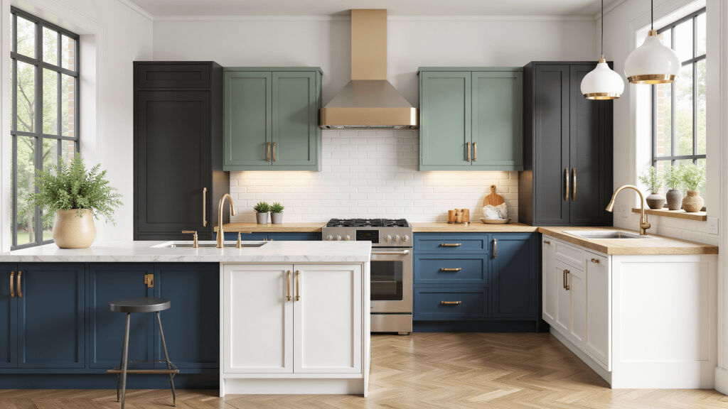
I painted a client’s lowers deep and kept the uppers white, and the kitchen finally had balance. two tone kitchen cabinets work because the dark base grounds the room while the pale tops keep it open, so the space reads as considered instead of flat.
🏠 Steal This Look
- Paint Color: Sherwin-Williams Naval SW 6244 for lower cabinets, Sherwin-Williams Pure White SW 7005 for uppers
- Furniture: Brass-finished bar stools with leather seats, open shelving in natural oak, waterfall-edge kitchen island in quartz
- Lighting: Matte black linear pendant lights over island, under-cabinet LED strips
- Materials: White oak uppers with visible grain, deep navy painted maple lowers, brushed brass hardware, Calacatta marble-look quartz countertops
I’ve watched this combination turn cookie-cutter kitchens into magazine-worthy spaces—the navy and white pairing feels simultaneously timeless and completely current, like the kitchen always belonged to someone with actual taste.
Why Two-Tone Cabinets Are Your Next Design Obsession
What Makes Two-Tone Cabinets So Magical?
- Creates visual depth and dimension
- Breaks up monotonous kitchen layouts
- Allows personal style to shine through
- Increases perceived kitchen value
🖼 Steal This Look
- Paint Color: Benjamin Moore Simply White OC-117 for upper cabinets, Benjamin Moore Hale Navy HC-154 for lower cabinets
- Furniture: Brushed brass bar stools with leather seats, open shelving in natural oak, waterfall-edge kitchen island in quartz with subtle veining
- Lighting: Linear LED pendant lights in matte black finish, 3-4 pendants over island at 30-36 inch spacing
- Materials: Matte ceramic subway tile backsplash, honed Carrara marble countertops, natural white oak floating shelves, aged brass cabinet hardware
There’s something deeply satisfying about opening a kitchen that feels layered rather than flat—like the room actually took some thought beyond a single swatch decision.
🛒 Get The Look
The Color Combinations That Will Make Your Kitchen Pop
Neutral Lovers’ Paradise:
- White + Espresso: Timeless elegance
- Cream + Soft Gray: Sophisticated calm
- Taupe + Ivory: Understated chic
Bold & Brave Palettes:
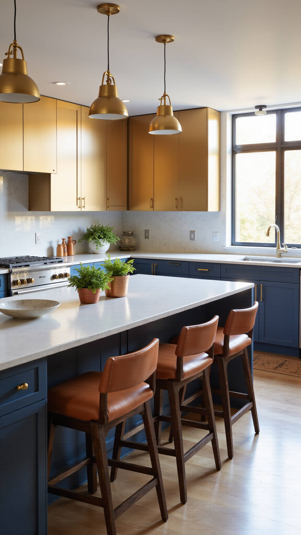
- Navy + Gold: Luxe modern vibes
- Sage Green + Warm Wood: Organic sophistication
- Charcoal + Crisp White: Dramatic contrast
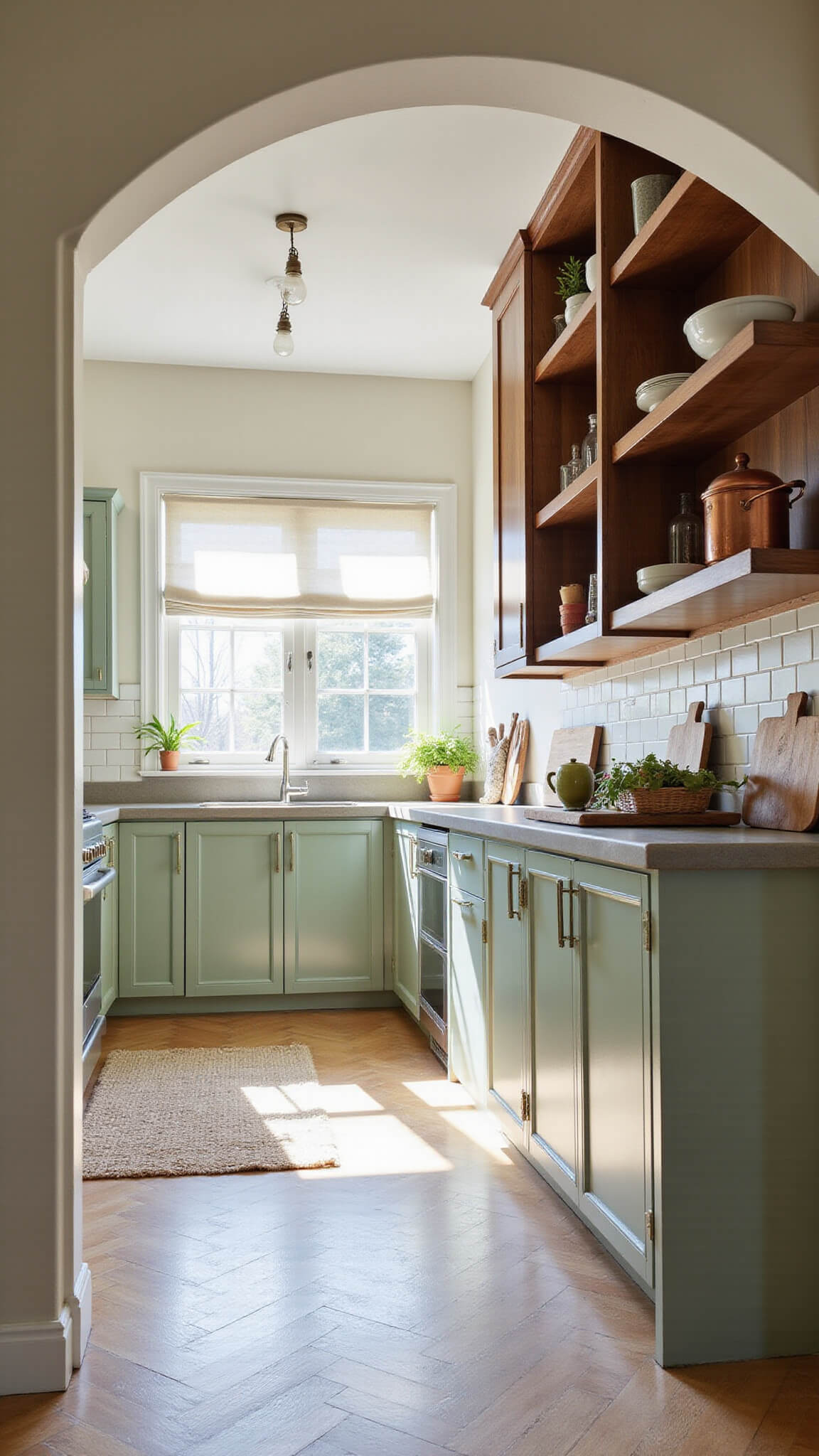
🌟 Steal This Look
- Paint Color: Farrow & Ball Hague Green 30 for lower cabinets, Farrow & Ball Wimborne White 239 for uppers
- Furniture: Shaker-style base cabinets in deep sage green, floating uppers in warm white, brass bar pulls, butcher block island with turned legs
- Lighting: Schoolhouse glass pendant lights with antique brass hardware over the island
- Materials: Unfinished white oak open shelving, honed Carrara marble countertop, hand-glazed ceramic subway tile backsplash, aged brass cabinet hardware
I keep coming back to this sage-and-white pairing in my own projects—it somehow feels both collected and completely current, like a kitchen that evolved over decades rather than a single weekend.
Budget-Friendly Design Secrets
Two-tone doesn’t mean two-mortgage. Here’s how to nail the look without breaking the bank:
Budget Breakdown:
- DIY Paint Project: $500-$2,000
- Professional Refinishing: $3,000-$8,000
- Full Cabinet Replacement: $5,000-$25,000
★ Steal This Look
- Paint Color: Behr Ultra Pure White PPU18-06 (upper cabinets) + Behr Black Mocha PPU5-01 (lower cabinets)
- Furniture: IKEA SEKTION base cabinets with custom painted fronts, open shelving brackets for uppers, butcher block countertop from lumber yard remnants
- Lighting: Matte black adjustable track lighting or plug-in pendant swag kits over peninsula
- Materials: Semi-gloss cabinet paint, foam rollers, cabinet-grade plywood for open shelving, brushed nickel or matte black bar pulls
I painted my own two-tone kitchen during a long weekend with a borrowed sprayer and three coats of patience; the transformation from dated honey oak to crisp white-upper/charcoal-lower felt like a $20,000 reno for under $600.
Pro Styling Tips That Designers Swear By
The 60/30/10 Color Rule:
- 60% Primary Color (Lower Cabinets)
- 30% Secondary Color (Upper Cabinets)
- 10% Accent Color (Hardware, Decor)
Hardware Matching Tricks:
- Match metal tones (brass pulls = brass accents)
- Create visual tension with complementary finishes
- Consider matte black for universal appeal
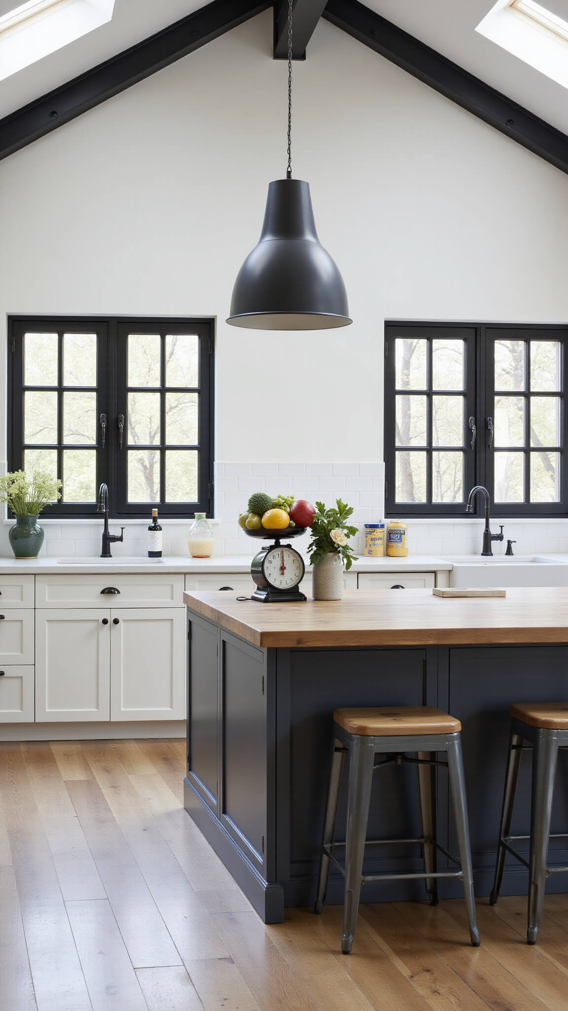
🎨 Steal This Look
- Paint Color: Valspar Swiss Coffee 7002-16
- Furniture: Shaker-style base cabinets in deep navy (lower), clean white uppers; quartz waterfall island with seating for three
- Lighting: Linear brass pendant lights over island, recessed can lights for task illumination
- Materials: Matte navy lacquer, warm white satin enamel, unlacquered brass hardware, Carrara marble-look quartz, natural white oak open shelving
I always tell clients that two-tone kitchens feel like intentional design rather than a safe default. There’s something deeply satisfying about opening a white upper cabinet and seeing that bold lower tone peeking below—it’s like the room has personality layers you discover over time.
Photography & Styling Hacks
Want those Pinterest-worthy kitchen shots? Here’s my insider guide:
Camera Settings for Killer Shots:
- Use natural morning light
- Aperture: f/5.6
- Shutter Speed: 1/100
- Focus on cabinet joints and hardware details
★ Steal This Look
- Paint Color: PPG Pure White PPG1001-1
- Furniture: open shelving with styled ceramic vessels, marble countertop surfaces, brass pot rails for vertical storage display
- Lighting: pendant lights with visible Edison bulbs, under-cabinet LED strip lighting for task illumination
- Materials: natural wood cutting boards, copper cookware, linen tea towels, matte ceramic canisters, fresh herb stems in glass vessels
I always keep a crumpled linen and a sprig of trailing eucalyptus nearby—those small organic touches soften the geometry of two-tone cabinets and make shots feel lived-in rather than staged.
Seasonal Styling Variations
Summer Vibes:
- Pale blue lowers
- Crisp white uppers
- Brass hardware
Cozy Fall Mood:
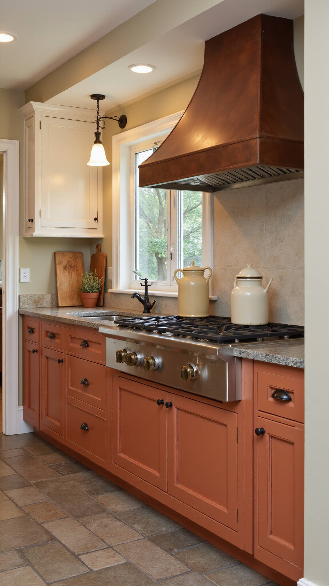
- Terracotta base cabinets
- Cream upper cabinets
- Wooden cutting boards as accents
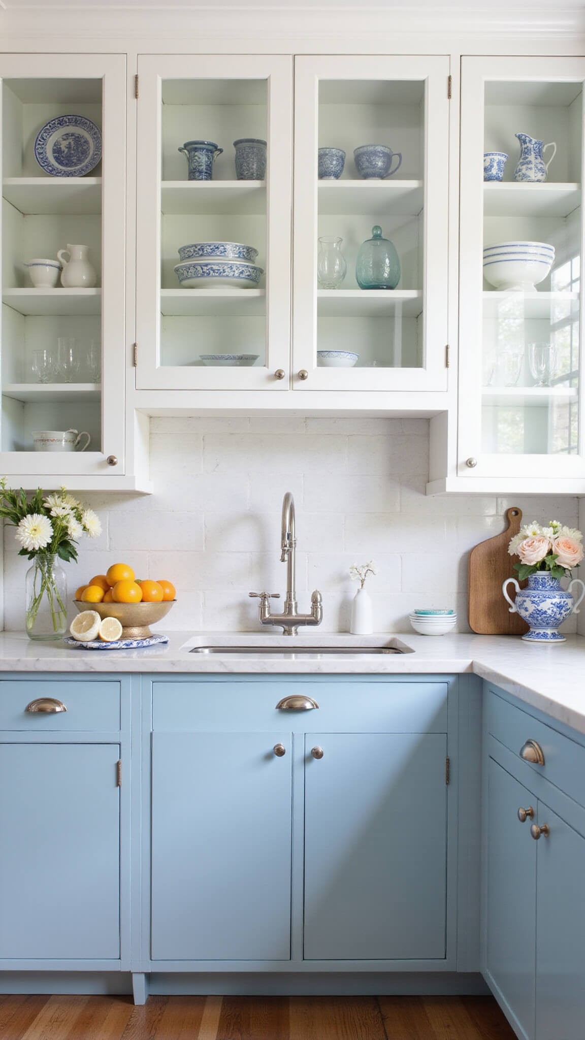
🎨 Steal This Look
- Paint Color: Dunn-Edwards Whisper Blue DEW 345 (pale blue lowers), Dunn-Edwards White DEW 380 (crisp white uppers); Dunn-Edwards Terra Sienna DET 435 (terracotta base), Dunn-Edwards Swiss Coffee DEW 341 (cream uppers)
- Furniture: Brass cabinet pulls and knobs; open wood shelving with live edge cutting board display; vintage-inspired brass pot filler faucet
- Lighting: Brass dome pendant lights over island; warm LED under-cabinet lighting to highlight seasonal displays
- Materials: Matte painted cabinet finishes; unlacquered brass hardware that develops patina; reclaimed wood cutting boards; terracotta ceramic accessories
I’ve watched clients light up when they realize their two-tone kitchen can shift with the seasons—the same cabinets feeling breezy in July and hearth-like by October, all through the simple alchemy of color pairing and curated accessories.
Common Mistakes to Avoid
Design Pitfalls:
- Clashing undertones
- Ignoring lighting impacts
- Overcrowding countertops
- Mismatched hardware
Future-Proofing Your Kitchen Design
Two-tone cabinets aren’t just a trend – they’re a design investment. By choosing timeless color combinations and quality materials, you’re creating a space that feels fresh for years.
Pro Tip: Always get sample swatches and test in YOUR specific lighting before committing.
Your Two-Tone Cabinet Checklist
- Choose complementary colors
- Consider your kitchen’s natural light
- Select cohesive hardware
- Test color samples
- Plan your budget
- Decide: DIY or professional?
Final Thoughts: Two-tone cabinets are more than a design choice – they’re a personal expression. Your kitchen, your rules.
Keep the counters neutral and the hardware consistent across both tones. two tone kitchen cabinets feel right when the two colors share one undertone.